

Healthcare platform: validating market fit and user needs, crafting an end-to-end platform, including branding, user interfaces, and CRM functionalities.
I worked with other 3 designers on this project in an agile way, with a fast-paced environment, implementing and iterating quicky to create a viable product.
Team
4 Designers
Company’s stakeholder
Deliverables
Key Phases
Design Process

Background
We had a meeting with the company’s stakeholder to understand the problems and its mission.
Design challenges
To build a MVP that offers the key deliverables for the later expansion of the brand.
To develop a clean, neutral aesthetic brand identity that aligns with the healthcare industry and resonates quality and trust.
User Research
Surveys & Interviews
Before we started brainstorming design solutions, we wanted to know how customers felt about their relationship with their healthcare services and their willingness to go abroad for medical check-ups.
We collected 100 survey responses, providing insights into people's behaviours regarding medical check-ups during holidays and their concerns about seeking preventive care abroad.
We followed up with 36 detailed interviews. By having these one-on-one conversations, we were able to gather more specific and in-depth information, which was super valuable in understanding our users on a deeper level.
Trust in their home country healthcare
"I get check-ups every time I go to my home country because I already know where to go”.
-A potential user
Making holidays unenjoyable
“I don’t want to find out I have diabetes while I’m on holiday”.
-A potential user
Not enough reason to travel abroad
"I won't go abroad just for a medical screening”.
-A potential user
Outcome
The information gathered from the interviews and surveys revealed that the proposed business goal had a low probability of success. People are not willing to travel for just for medical screening. If they are currently going abroad to do so, it’s because it’s their home country, and they have already the contact there.
Reshaping the concept
Our research showed that the majority of interviewees were familiar with people travelling abroad for medical or cosmetic treatments.
Desk research
We wanted to dive in and find more information about medical tourism before presenting the idea to the stakeholder. We found that there’s a high increased by the rapid expansion of the medical tourism industry.
NHS waiting list
NHS waiting list hit record of 7.8 million in September 2023, delaying operations like joint replacements and cancer tumour removal.
Booming industry
The global medical tourism market was valued at $19.28 billion in 2022, projected to be $93.38 billion by 2030 at 21.3% CAGR.
We held a meeting with the stakeholder to present our findings and after discussing a few options proposed. We decided to iterated the mission to craft a product that balances users pain points, business viability and technical feasibility.
New goal
Target audience

Based on our research and mission, our target audience was clear:
People who are on the NHS waiting list, seeking faster access to treatment, who can't afford private treatment in the UK or want more affordable cosmetic treatments.
Competitor analysis
To evaluate Afia's potential position in the market, we analysed 9 competitors that offer medical procedures in the UK and abroad.


Conclusions
Some characteristics of these competitors that helped guide us through the design creation process and determine how Afia would fit into the market were:
What differentiates Afia from the rest?
The evolution of the brand
Logo
My team and I conducted research and brainstorming sessions to design Afia's logo, representing the fusion of relationships and healthcare—the core focus areas of the company.

Relationships
+
Healthcare
Colour palette
The logo development influenced our brand colour palette selection. We chose colours that reflected the warmth of the service while aligning with healthcare industry standards.
Typography
Customer experience map
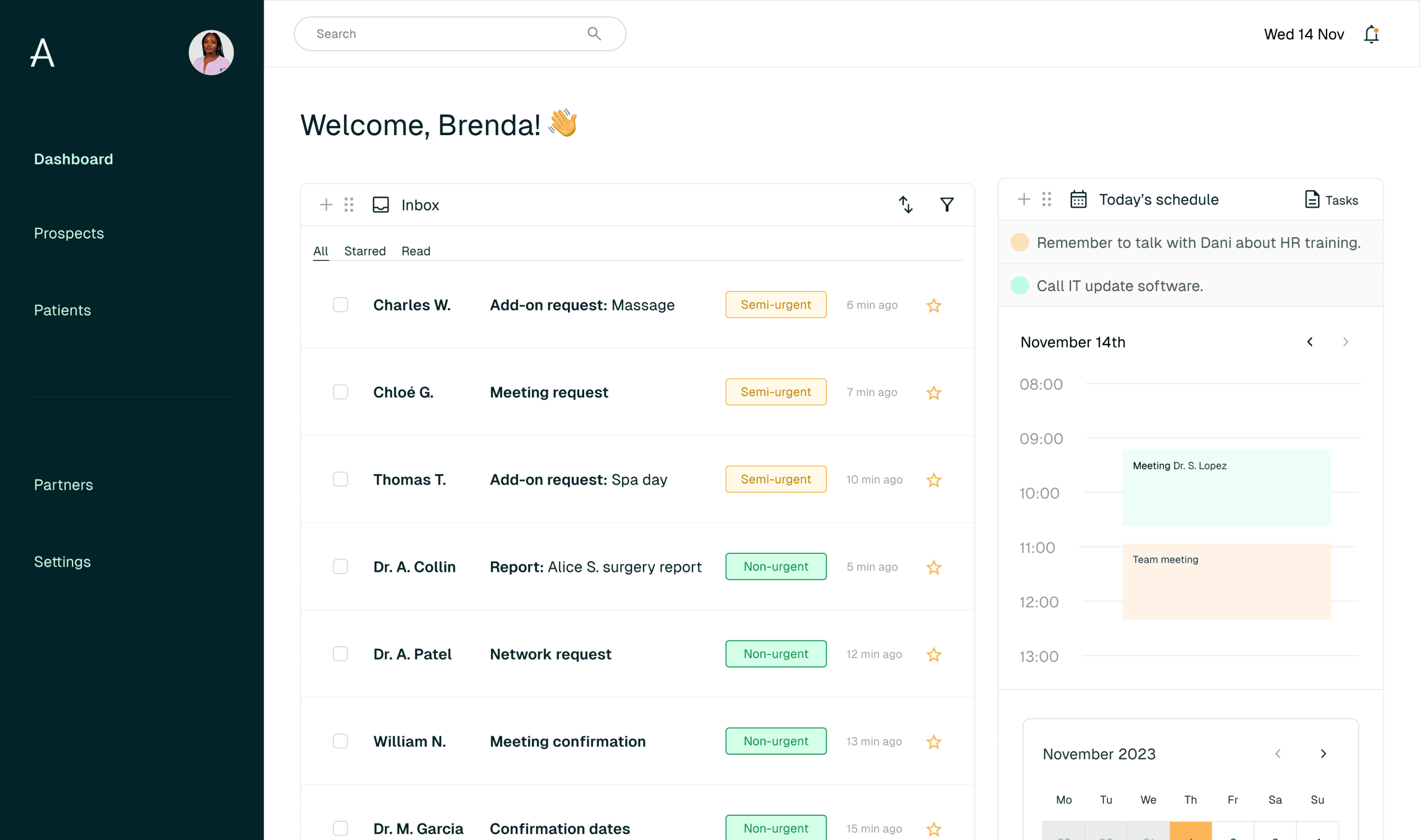
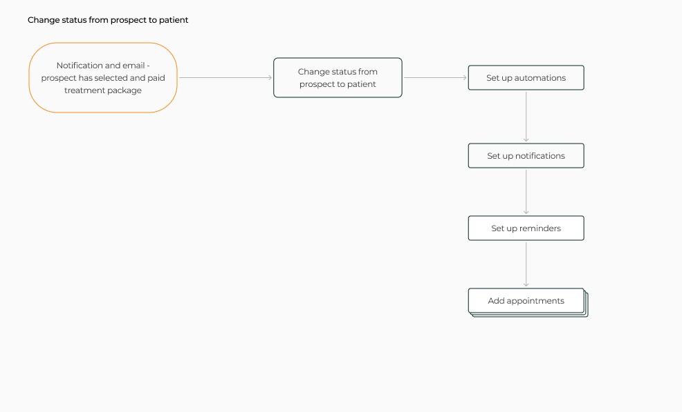
We designed a comprehensive platform and service from both the patient's and Afia's perspectives- including everything from initial platform discovery to patient feedback collection.

Find a Solution
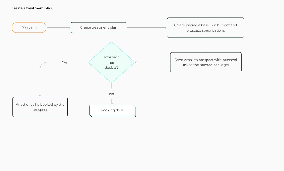
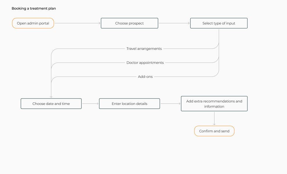
User Flows
To understand how users will interact with the website, the client portal on desktop and on app, and Afia's team in their portal, we mapped out the step-by-step user flows from the initial onboarding to the post-treatment of the patient on both ends. This enabled us to identify pain points and opportunities to optimise the user experience. Our goal was to create intuitive paths that fulfil user needs with minimal friction.
Client

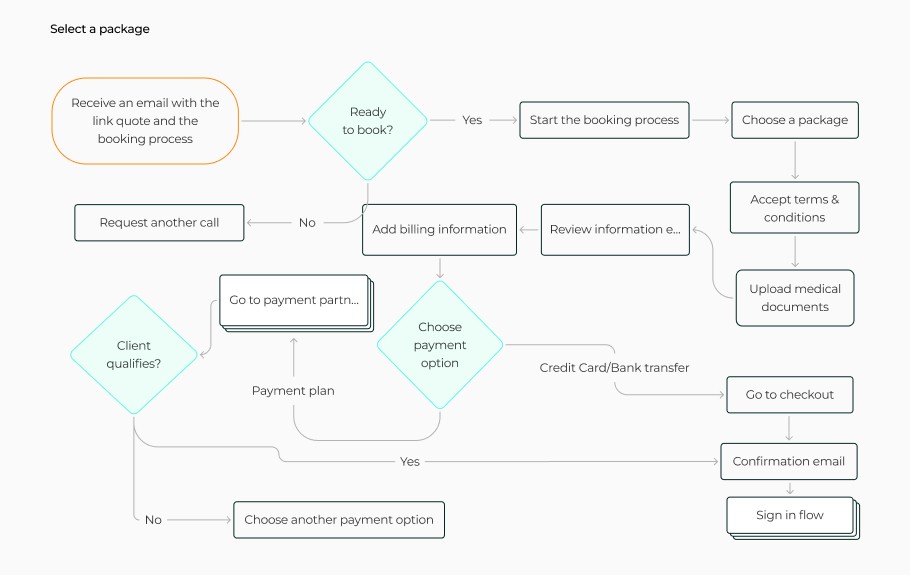

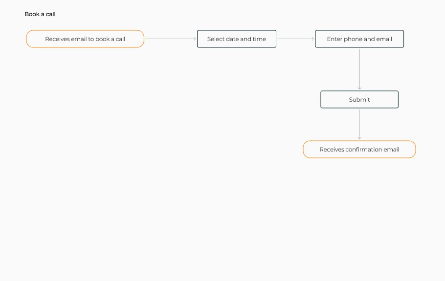

Afia


Sketches
We used sketches to rapidly explore ideas and user flows. Through iterations and feedback, we implemented changes into our design to better fulfil the user’s and Afia’s needs.


Low-fidelity wireframes
Then we went digital and created the low-fidelity prototypes where we explored potential solutions. Focusing on just the concepts rather than details allowed us to rapidly ideate and evaluate. This iterative approach enabled the identification of an effective design direction before additional specific elements were added.


High fidelity
We created high-fidelity prototypes that fully realise the intended user experience. These interactive prototypes accurately reflect the final product's visual design, content, and functionality.
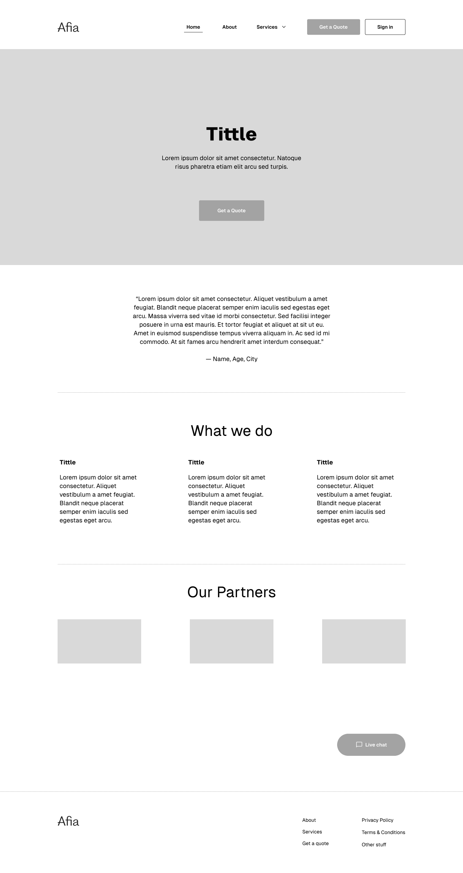
Website


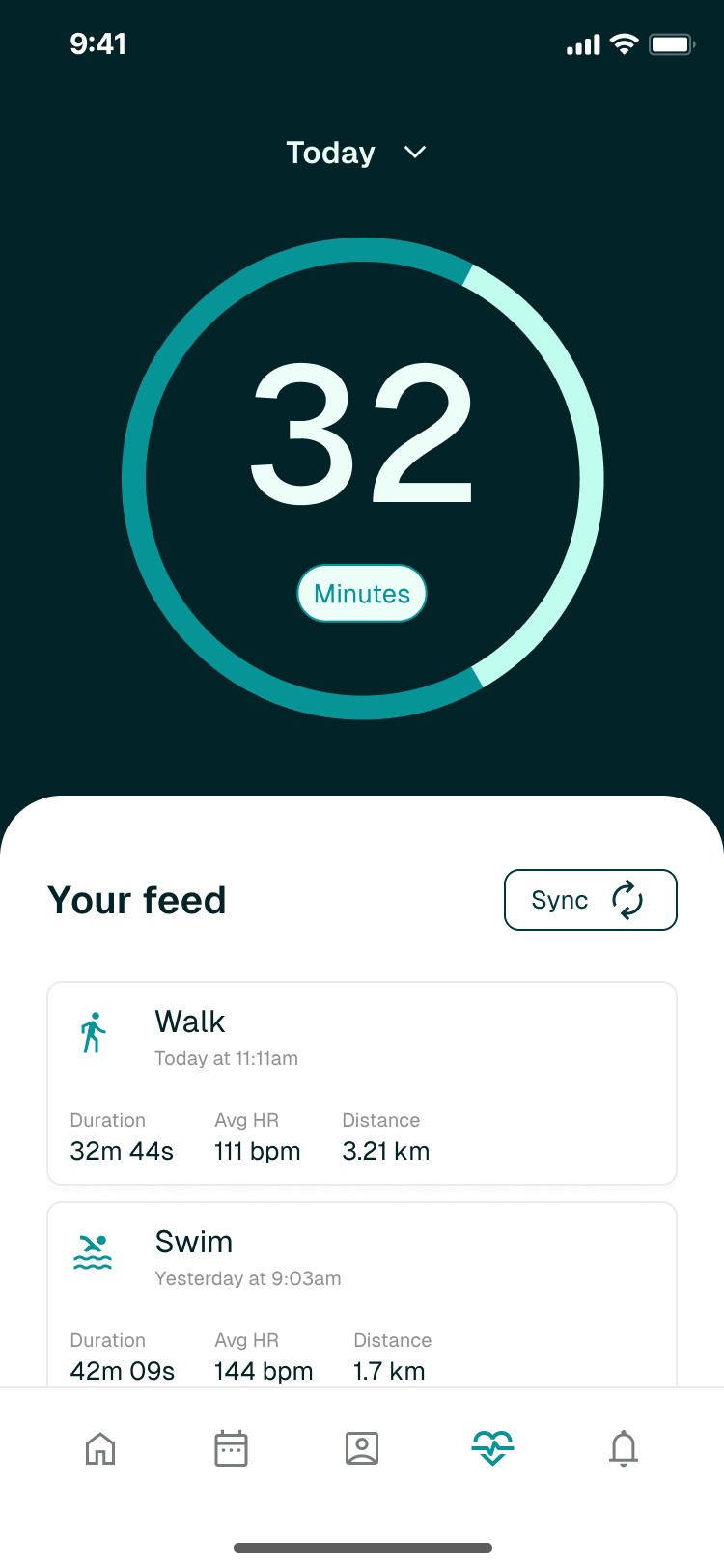
Patient Portal


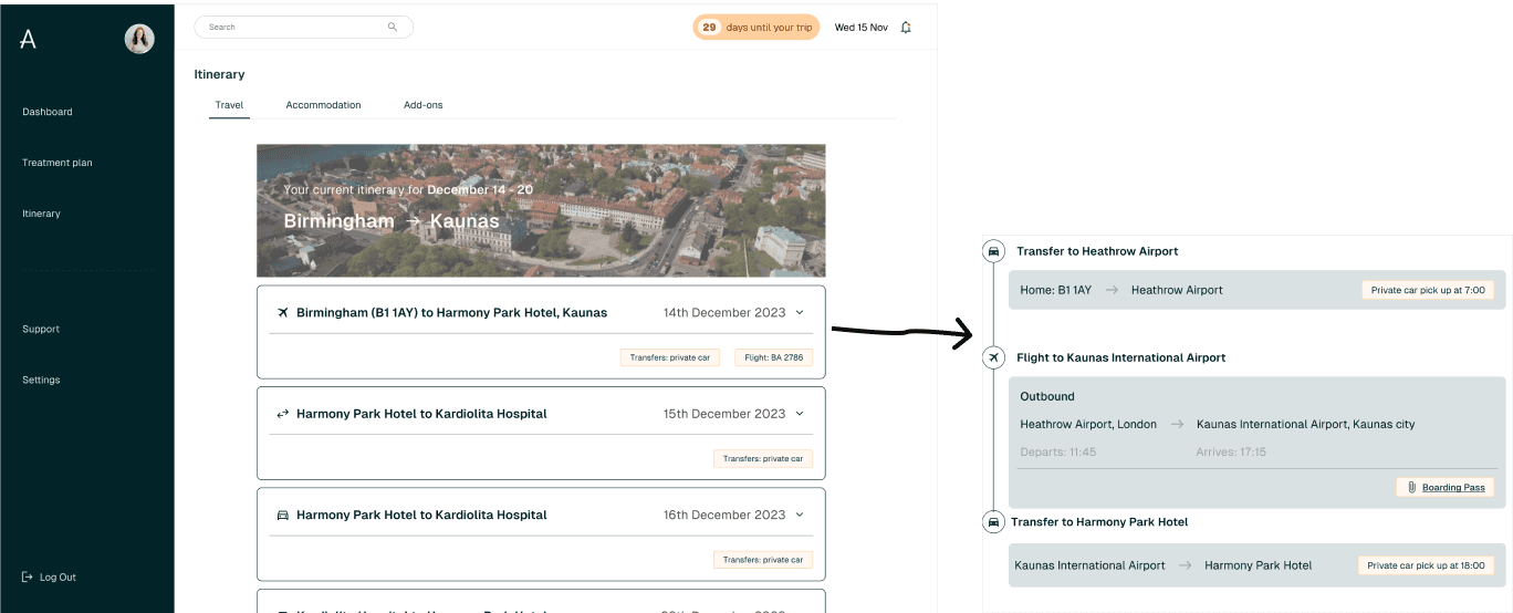
Itinerary


Outcomes
Balances business viability and market fit
Our research identified a gap between business objectives and market demands. We bridged this gap by designing a product that meets both needs.
Trustworthy and warm brand
We developed a brand that brings a sense of trustworthiness and professionalism while being approachable. It emphasises a holistic approach that sets Afia apart from competitors.
End-to-end service
We created an end-to-end service journey for both the customer and Afia. Streamlining both ends with an easy and permanent contact to provide the best possible experience for the patients.
Final thoughts
What did I learn?
Design system
A functional design system is essential for maintaining consistency across features when working with multiple designers.
Team communication
The importance of having clear and open communication within the team, exploring all the thoughts and determining clear roles.
What would I have done differently?
Scoop & time constraint
We underestimated the scope of work required within our limited timeline, which led to an intensive design process.
Stakeholder workshop
With more time available, we would have conducted a stakeholder workshop to present platform sketches and flows, incorporating their feedback into the design.